Tutorials
Brian had an image where the judge commented that the background was distracting. Let's see what we can do
Toning down distracting backgrounds
08/05/2014
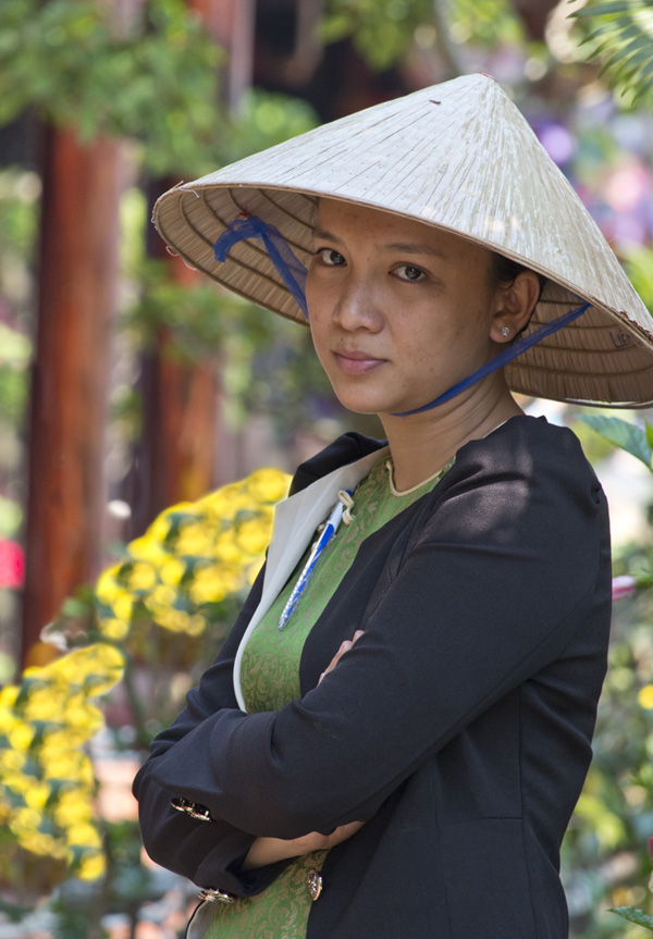
This is the original image. The yellow flowers are too bright and some evidence of manipulation can be seen.
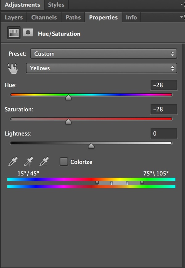
Create a Hue and Saturation layer. Select yellow and adjust the saturation to reduce the yellow (you can use the droppers to pick up the yellow, add or subtract other yellows.) The yellow is still annoying so adjust the hue to be a less 'yellow'. If required you can adjust Lightness. It is just best to play with these sliders to get a result you like. The yellow adjustment also tones down the green in an acceptable way.
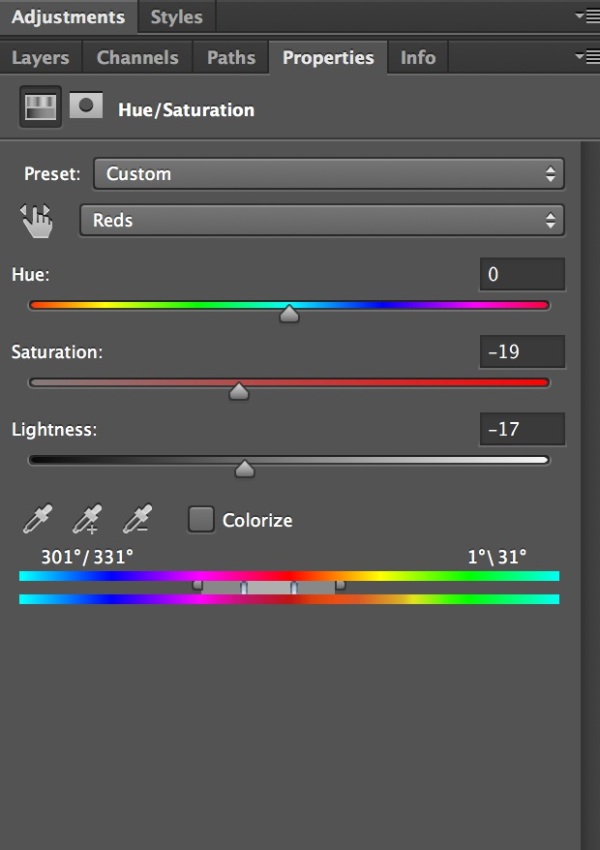
There was a distracting bit of red on the left. Pick Reds and use the three sliders to get a toned down 'red'.
Below is the result after adding the mask that can be seen below the image. The H&S adjustments had a small effect on the lady which were not wanted. Using a black brush on the mask allowed the original lady to show through.
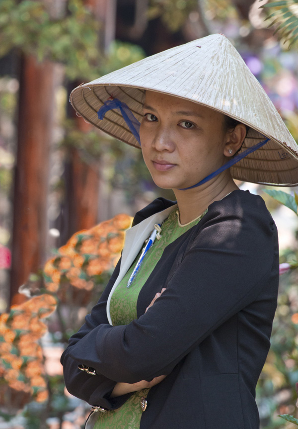
This is the result of the H&S layer but the background still is a bit distracting, there are some hard edges in the flowers.
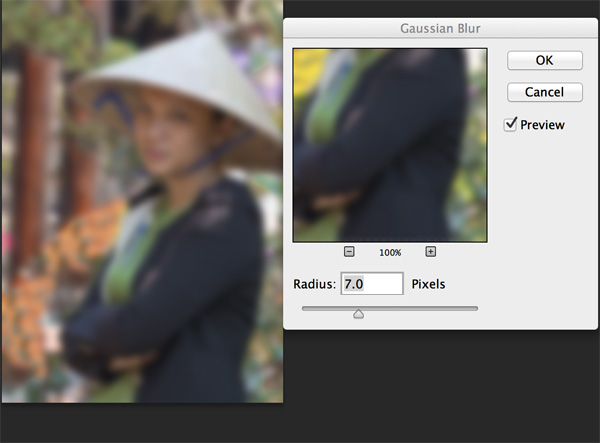
Introducing a duplicate layer and adding Gaussian blur to that layer blurs the whole image. The level of Gaussian blur is your choice. Adjust the slider until the preview shows the background the way you want it to be.
The Gaussian Blur doesn't do a lot for the lady. Therefore add a mask and reveal the original lady as shown in the second layer below.
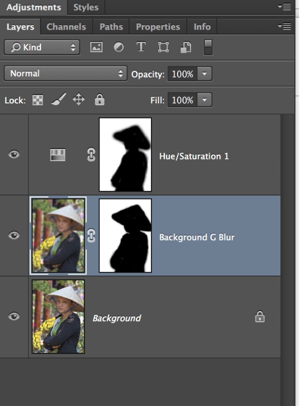
These are the layers and masks
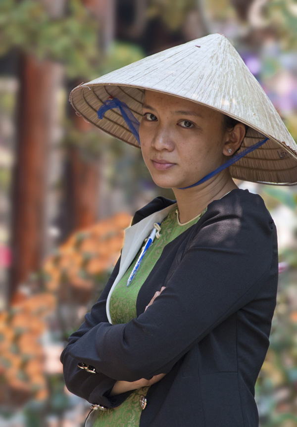
Here is the final adjusted image which shows the beautiful half smile that Brian captured without the distracting colours and details in the background.
Thanks to Brian Wigley for allowing me to use his image to demonstrate the technique.
We had some other images where the judge commented on the bright foliage in the background, this technique can tone it down!
Rex
